

Overview
This is the next installment in a sequence of posts designed to take a close look at the way we design our course syllabi. (Revisit the first post, Fonts, here.) Small, incremental improvements to the design elements of a syllabus provide an easy entry point into making Geneseo courses more inclusive, and more accessible.
This time, an exploration of the wild world of color.

COLOR CONTRAST
An inclusive course syllabus takes many factors into account. This includes how readable the document is, in both print and on-screen versions.
Some syllabi may make very little use of color, consisting primarily of black text on a white page. Other courses may utilize vibrant color, to emphasize the subject matter of the course (looking at you, Art History), to humanize the professor (selfies with pets always appreciated), or to visually sequence the pacing or grade scale for the semester.
Regardless of the reasons why color is introduced in a document, a quick evaluation of color contrast will make sure that it’s impactful for everyone seeing it.
Considerations – Who’s Impacted?
- Readers with limited vision
- Readers with color blindness
- Readers using a low-resolution or monochrome display
Making color choices more inclusive
Color perception likely varies from person to person, mostly in small ways. Larger ways include many kinds of color-blindness, affecting 1 in 12 men and 1 in 200 women.
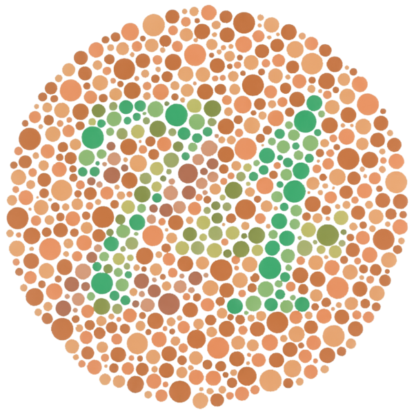
“Ishihara Plate 9” is in the public domain
Electronic screens add another layer of color complexity, since different monitors and resolution sizes alter the way we understand visual elements. Any of us can experience visual impairments while using technology with poor wifi connections, or sub-par equipment.
Color is an inviting way to make a syllabus more exciting, and certainly something to use as desired. Some considerations as you do so follow.
Pump Up the Contrast
Background and foreground color shifts, like the one used here, are an excellent visual aide to indicate important passages in a syllabus. If the color palette between background and foreground is too subtle, though, like white text on a pastel background or medium-grey text on a light-grey background, then contrast is probably insufficient for many students.
Web Content Accessibility Guidelines (WCAG 2.0) require that “the visual presentation of text and images of text has a contrast ratio of at least 7:1.” The image below presents four different foreground/background color-contrast examples to illustrate these ratios.
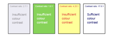
Of these four examples, only the one on the far right meets the WCAG 2.0 standard of color contrast. Figuring out whether a color combination meets that 7:1 standard might seem daunting to the naked eye, but easy-to-use tools can assist us.
- WebAIM’s Color Contrast Checker allows you to select or enter color values to test and provides you with a “pass” or “fail” on your contrast ratio.
- ACART’s Contrast Checker can be used to both check color contrast and view your selections in grayscale. This tool also allows you to keep a history of the color combinations you have tested.
- Giacomo Mazzocato’s Accessibility Color Wheel includes several options for testing your color selections, including simulations of three types of color blindness. You can also opt to test what your contrast ratio is when the foreground and background color selections are inverted.
(For the record, the color block in the first paragraph of this section has a ratio of 10.48:1, and so is considered accessible.)
Hyperlinks
Even in syllabi using very little color, hyperlinks are one aspect where color might sneak in. Hyperlinks should be visually distinct from both the surrounding, non-linked text and background color. If you do not underline your links (or provide some other non-color cue), you must ensure that you provide both sufficient contrast between the link and background colors and between the link color and that of the surrounding text.
Web Content Accessibility Guidelines (WCAG 2.0) require a:
- 4.5:1 contrast between the link text color and the background
- 3:1 contrast between the link text color and the surrounding non-link text color
Default settings for hyperlinks in word processors generally meet this requirement on a white background. If other background colors are used, or if you’ve customized your link colors, run a contrast test using the tools above to verify they meet WCAG 2.0 requirements.
High-Contrast Mode
Some students need to see light text on a dark background for it to be readable, while others require dark text on a light background. Students with low vision must be able to see content when it is displayed in high-contrast mode. This can be a subjective experience, based on individual student needs. Try testing your text and image-based content as you go by using high-contrast mode on your own computer and making adjustments as needed.
All content items such as text, images, bullets, and table borders must be visible in both regular and high-contrast modes.
- PCs using Windows can use these instructions from Microsoft for turning on high-contrast settings
- Mac OS users can find instructions for turning on high-contrast among other display-related accessibility features from Apple here
For reference, the following images show the original photo at the top of this post, and what it looks like with the contrast value turned all the way up on my MacBook Pro.
Original Contrast Version 
High Contrast Version
What Does Your Color Mean?
Relying on color as the sole means of conveying information can be problematic. If the point you are making depends on color to be understood, you will need to edit your materials so that concepts presented in the visuals are not lost to those who are color blind or who require high contrast between colors.
Example 1: Inaccessible Bar Chart
In Chart 1, color is the only means by which information is conveyed. For students who are color blind, have poor contrast vision, or are using a black-and-white print copy, as in Chart 2, relevant information is lost. Imagine if this was the only way students are given information about the grading scale in the course?
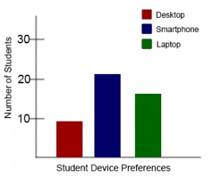
Chart 1: In this bar chart, color is the sole means of communicating data. 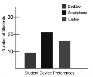
Chart 2: This view of the same bar chart displays how the chart might appear to a student who is color blind, or whose device does not display color. All of the meaningful data is lost.
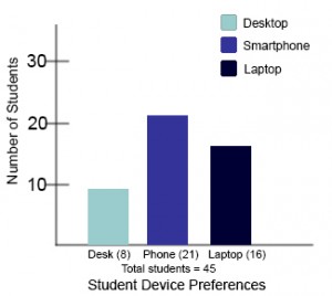
Example 2: Accessible Bar Chart
High-contrast shades are much more distinguishable to a broad population, including students who are color blind. In Chart 3, contextual labels have also been added to each bar at the bottom of the chart.
Another solution would be to add a different distinctive pattern to each color in the chart, combining red with cross-hatching, blue with circles, and green with plaid, for instance.
Takeaways
- Use a color contrast comparison tool, like WebAIM’s, to check for readability of text and hyperlinks
- View your document in high-contrast resolution to ensure all information is still visible
- Don’t rely on color alone to convey information in your document
Additional Resources
- WebAIM: “WCAG 2.0 and Link Colors”
- NIH: “At a Glance: Color Blindness”
- CNet: “7 MacOS Display Settings to Help You See Your Mac Better”
Attributions
Portions of this article were drawn from the following sources:
- “Images” from Accessibility Toolkit – 2nd Edition by Amanda Coolidge, Sue Doner, Tara Robertson, and Josie Gray is available under a Creative Commons Attribution 4.0 International License
- “OER Accessibility Toolkit” by the Centre for Teaching, Learning and Technology at the University of British Columbia is available under a Creative Commons Attribution-ShareAlike 4.0 International License